

Sale Home Kit 2015-16 Reviewed: Old is New (and Stripy) Aga
By Northern Shark
September 4 2015
A review of Sale Sharks's new home kit.
This article has been lifted wholesale with permission and grateful thanks from http://sharktankrugby.weebly.com/
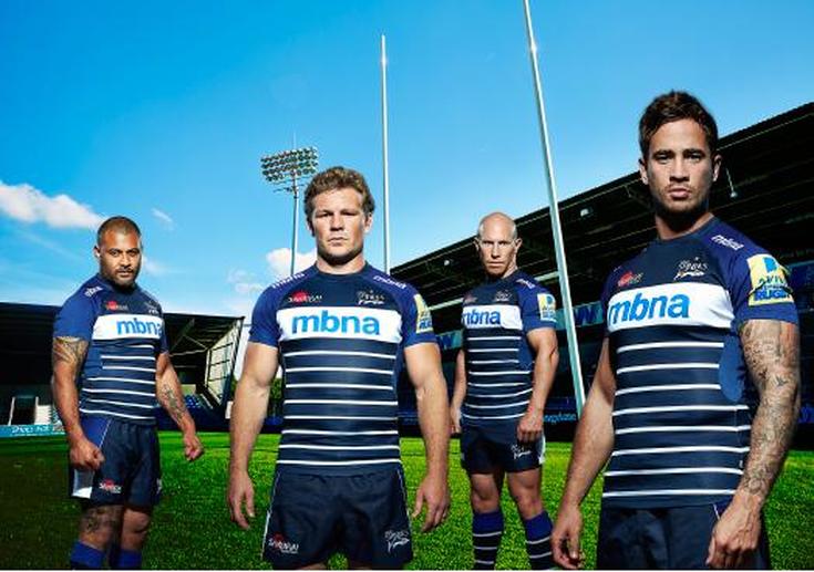
But then the real pictures began to roll in:
Unveiled - here's @SaleSharksRugby new-look home strip for the 2015/16 campaign http://t.co/N3FhJxLYDl pic.twitter.com/v6RujftpUf
— Neil Leigh (@salesharksMEN) September 3, 2015
And now that we've seen what the kit really looks like? - I'm a huge fan.
Is it as good-looking a kit as the hoop-and-fin design Sale have worn for the past two seasons? No, but then again that kit might have been the best-designed Sale have had since they adopted the 'Sharks' moniker in 2001 so to directly compare the two is a little unfair. But with this new kit, there are lots of small details, tweaks and subtle updates that really make it standout as one of the better kits around the Premiership this season.
The Shirt
Overall regarding the front of the shirt, the stripes look great, the colours work well and the white sponsor strip is a lot less prominent than first thought and makes a nice dividing line between the shirt's design and the compulsory workdmarks and logos that adorn every modern kit. It would have been nice to perhaps have had the striped design extend to the full body of the kit rather than just the bottom 3/5ths but there is always the danger that it would make the shirt appear too cluttered, which is the last thing a fashionable rugby kit should be.
However its the back of the shirt which really elevates Sale's design choice.
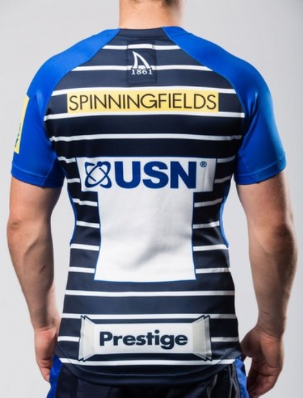
The delightfully simple 1861 Shark Fin crest returns on the nape of the neck, once again a great way of highlighting the club's 150-plus year history and having the horizontal stripes pass through the 'patch' make it so much more understated and natural than having it separated by its own white box. Another great design choice.
The Shorts
This year Samurai have toned things down slightly, replacing the weird blue pentagon shape with a simple rectangle and a smaller white rectangle at the bottom and dispensing with the white outlines for a much more simplistic look. They look better than the last kit but I still don't know if the additional colours are necessary with navy shorts. Is there anything else to say?
The Socks
Overall
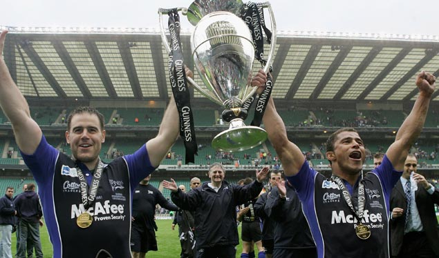
Without overanalysing every single shade and stripe of the new kit, the smaller, less obvious design features of the new kit are really what make it work. The shirt in particular plays the customary homage to Sale's heritage with some neat design choices that simultaneously keep it feeling fresh and modern with the added bonus of celebrating the 10-year anniversary of Sale's only Premiership title with some mirroring of the kit they wore that famous day in 2006. The shorts and socks have also been simplified and give the kit a nice sense of consistency.
One feels the limitations of Samurai's Iconix™ template perhaps hold the shirt back from the 'iconic' category and even if less prominent than originally thought, the white MBNA sponsor strip is such a sharp contrast to the rest of the shirt that it definitely feels obtrusive especially as it limits the horizontal striping to only 3/5ths of the front of the shirt which I know will not be the most popular of choices. However sponsorship is a big part of the modern game and therefore perhaps unavoidable so perhaps I shouldn't mark it down too harshly for that.
VERDICT: 7.5/10